
Self-host yuvomi
v2.87.0Self-hosted family planner for tasks, calendar, meals
- Stars
- 2 328
- RAM
- 256 MB
- Port
- 3000 (HTTP web interface)
- Requires
- SQLite
ghcr.io/ulsklyc/yuvomi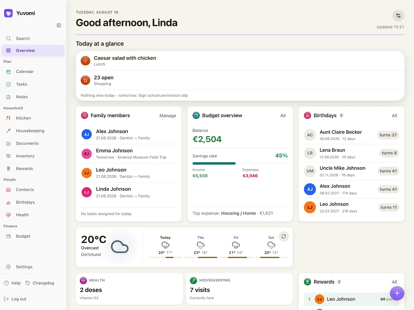
What is yuvomi?
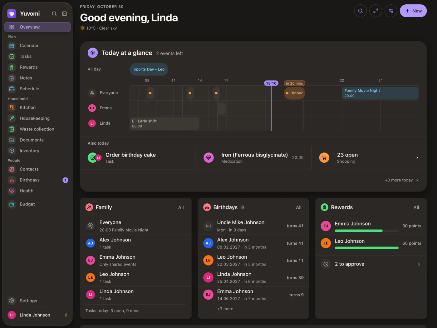
This self-hosted web application consolidates household management into one place, replacing multiple commercial apps. It runs in a container on personal servers or NAS devices, including Raspberry Pi hardware, and provides a browser-based setup wizard plus one-click installation for TrueNAS, Umbrel, and Unraid. All data resides in a single SQLite file with optional AES-256 encryption, the interface speaks 26 languages, and it works as a Progressive Web App with offline access and push notifications. Twenty modules cover tasks, calendars, meal planning, recipes, shopping, pantry, budgeting, documents, health, contacts, birthdays, rewards, housekeeping, waste collection, and inventory — each can be toggled per household. Role-based permissions control what each member sees. External connections include two-way Google and CalDAV calendar sync, CardDAV contacts, Google Drive and WebDAV document storage, Mealie and Tandoor recipe mirrors, Immich photo screensaver, OpenHolidays, Open-Meteo and OpenWeatherMap weather, and notification delivery via Gotify, ntfy, webhook, and email. Sign-in supports TOTP two-factor authentication, invite links, optional OIDC single sign-on, and household-wide 2FA enforcement. The codebase is MIT-licensed with no paid tiers.
yuvomi alternatives
 OcularOcular is an open-source, self-hosted budgeting app for tracking personal finances across multiple years with dashboards, dark mode, PWA, and Google Sheets import.CompareOcular with yuvomi
 Will Be DoneSelf-hosted task manager with visual weekly timeline. Local-first, works offline, syncs across devices, runs in one Docker container with SQLite.CompareWill Be Done with yuvomi
 PrismA self-hosted family dashboard for wall displays and tablets that connects to calendars, task apps, photo services, and grocery stores without recurring fees.ComparePrism with yuvomi
 JournivA self-hosted private journal with moods, activities, goals, prompts, media uploads, full-text search and analytics, run with Docker Compose, SQLite or PostgreSQL.CompareJourniv with yuvomi
 umbrelOSA self-hosted home server OS you flash onto Intel, AMD or Raspberry Pi devices: browser setup, 300+ one-click apps, Files, Photos, backups and an MCP server.CompareumbrelOS with yuvomi
 Personal Management SystemOpen-source, self-hosted personal data hub: notes, contacts, encrypted passwords, payments, schedules and files, run via Docker Compose with MariaDB.ComparePersonal Management System with yuvomi
 EverShelfEverShelf is a self-hosted, open-source smart pantry manager with barcode scanning, AI expiry tracking, smart shopping lists, and Home Assistant integration.CompareEverShelf with yuvomi
 journiv-appJourniv - Self hosted private journaling appComparejourniv-app with yuvomi
All self-hosted alternatives to Google Calendar → All self-hosted alternatives to Mealime →
Should you self-host yuvomi?
yuvomi scores 74/100 on selfhost.directory (how scoring works) and ranks #2 of 14 in Home Management. It has 2 328 GitHub stars, +666 in the last 30 days.
It shipped 461 stable releases in the past year. The latest, v2.87.0, came out on 9 November 2026.
Setup is moderate: expect some configuration beyond a single command. An official Docker image is available. It is MIT-licensed and written mostly in JavaScript.
Its closest alternative on selfhost.directory is FreedomBox (64/100). yuvomi scores higher overall. See yuvomi vs FreedomBox side by side.
Features
- API & MCP
- Budget & Finance
- Calendar
- Contacts & Birthdays
- Document Management
- Health Tracking
- Housekeeping
- InventoryOff by default
- Meal Planning
- Pantry Management
- Recipe Management
- Rewards System
- Shopping Lists
- Task Management
- Waste CollectionOff by default
yuvomi README

The self-hosted family planner.
One home instead of many subscriptions.
Tasks, calendar, budget, meals, health and more for a family, a couple or just you, on a server you own.
→ Take the tour on yuvomi.cloud · Install · Docs · Changelog · Auf Deutsch
20 modules · 27 languages · 0 trackers · 1 SQLite file · 256 MB RAM minimum

Most households glue their life together from a dozen paid apps, each with its own account, its own subscription and its own copy of your data on someone else's server. Yuvomi puts all of it in one place that belongs to you, running as a container on any home server or NAS.
How to install yuvomi
Install yuvomi with Docker Compose
SESSION_SECRET, DB_ENCRYPTION_KEY, OIKOS_HTTP_PORT, DATA_DIR, BACKUP_DIR, MODULES_DIR, DOCUMENT_STORAGE_LOCAL_DIR, DOCUMENT_STORAGE_LOCAL_PATH, DOCUMENT_STORAGE_LOCAL_ENABLED, SESSION_SECURE, TRUST_PROXY, and many optional integration variablescurl -O https://raw.githubusercontent.com/ulsklyc/yuvomi/main/docker-compose.yml curl -O https://raw.githubusercontent.com/ulsklyc/yuvomi/main/.env.example cp .env.example .env openssl rand -hex 32 # SESSION_SECRET openssl rand -hex 32 # DB_ENCRYPTION_KEY
Edit .env and replace both REPLACE_WITH_… placeholders
docker compose up -d
Requires Docker and Docker Compose. Generates SESSION_SECRET and DB_ENCRYPTION_KEY.
Install yuvomi with Windows
git clone https://github.com/ulsklyc/yuvomi.git && cd yuvomi node tools/installer/install-server.js
Open http://localhost:8090
Browser-based wizard in 27 languages. Detects Docker/Podman, configures .env, sets up SSO and backups, prepares for HTTPS reverse proxy, starts container, creates admin account. Requires Node.js 22+ on host.
Install yuvomi with Podman
Same as Docker Compose plus OIKOS_HTTP_BINDcurl -O https://raw.githubusercontent.com/ulsklyc/yuvomi/main/podman-compose.yml curl -O https://raw.githubusercontent.com/ulsklyc/yuvomi/main/.env.example cp .env.example .env openssl rand -hex 32 # SESSION_SECRET openssl rand -hex 32 # DB_ENCRYPTION_KEY
Edit .env and replace both REPLACE_WITH_… placeholders
podman compose -f podman-compose.yml up -d
For RHEL, Fedora, CentOS Stream with SELinux support. Includes :Z volume labels.
yuvomi releases & version history
AI summary Added signed release tarballs
Added
- Every release carries a signed tarball of the app. Next to the container image, each
GitHub release now hasyuvomi-<version>-dist.tar.gz, aSHA256SUMSfile and a build
provenance attestation that proves GitHub built both from the release tag of this repository
(gh attestation verify yuvomi-<version>-dist.tar.gz -R ulsklyc/yuvomi; steps in the
installation guide). For now the tarball holds the same files as GitHub's source download.
The YunoHost package and the Proxmox script will install from it next, so that later
releases can ship a built web app there without changing how those installations update. A
release only becomes visible once the tarball is on it, so no channel picks up a release
without its file.
Fixed
- Storage and backup errors in settings say what happened, in your language (#2622). When
document storage or a WebDAV backup failed without a technical class to show, settings put an
English server sentence ("WebDAV upload failed.") into the translated message instead of the
app's own sentence. A connection test without URL, username or password now says so. A backup
that fails on this server, for example because the local file is missing, is no longer
reported as a refusal of the WebDAV server. The technical class of a storage failure is shown
only to the administrator in the storage settings, not to members uploading or opening a
document. A malformed notification channel form answers with a general error instead of an
engine message.
Security
- Two administrators demoting each other no longer leave the household without one (#2612).
When two administrators removed each other's admin role at the same moment and each also set a
new password, both changes could pass the "at least one administrator must remain" check and
both went through, so nobody could open the administration any more. The check and the change
now happen in one step: one of the two demotions is refused, and one administrator stays. - A demoted administrator loses admin rights on every device (#2611). The role of a signed-in
browser was taken from the stored session, and a demotion only updated the sessions that existed
at that moment. A sign-in that was still checking the password, or a request starting the SSO
link, could save the session again with the old administrator role and keep it for up to 90
days, past module rights as well. The role now comes from the account on every request, so a
demotion applies to every session at once. - A calendar feed no longer serves a member whose module was taken away (#2615). The six
subscription links (calendar, birthdays, inventory deadlines, cycle, schedule, waste) never asked
the member's module permission, so somebody set to "no access" for the calendar kept receiving
every household event in their calendar app, other members' private ones included. Such a feed
now stays empty instead. The subscription itself stays valid and fills again once access is given
back; "read only" keeps delivering, and administrators are not affected. - Medication reminders reach only members who may see Health, and never a household
notification channel (#2602, #2598). The medication scheduler sends on its own instead of
going through the regular reminder delivery, and checked neither filter that path has. A
member whose Health permission was set to none still got "Ibuprofen" by push and on their
channels, and a caregiver kept getting another person's doses ("Anna: Ibuprofen") after their
access to Health was taken away. And every dose went to the household's shared channels (ntfy,
Gotify, webhook or e-mail), private medications included, plus one copy per caregiver with the
person's name in front. Now a recipient with Health set to none is skipped (the dose is still
logged), and a dose goes out only by push and to channels the recipient owns, whatever the
medication's visibility - like every other health reminder, as SECURITY.md promises. Reading
access and administrators are unaffected. - Error texts of CalDAV, CardDAV and iCloud servers no longer reach the browser. When a
calendar or contacts server refused a connection test, a sync or a calendar listing, the answer
carried the raw text of the server or the DAV library, with its address, port and path. The
answer now names the kind of failure instead: rejected sign-in, an HTTP status, or an
unreachable server with its network code. Settings show that class to the administrator in
their own language. - Google, Outlook, feed imports, holiday sync and the logo search no longer pass foreign error
texts to the browser. Missing configuration answered with the names of server variables, a
failed Google or Microsoft request with the text of their libraries, and an unreachable feed,
website or waste collection source with the network error naming host and port. These answers
now carry a fixed sentence with the kind of failure (reason, and the class such as
HTTP 503orECONNREFUSEDindetail); missing configuration and an expired Outlook sign-in
are cases of their own. - Database, filesystem and WebDAV texts no longer reach the browser from backups, documents,
modules, shared expenses, notification channels and shopping-list mail. A failed WebDAV
backup test repeated the server's status line with its internal host and path, a broken
module folder answered with the absolute path on the server, and a database error while saving
a shared expense or a notification channel went out as a 400 with SQL text. Own input errors
keep their sentence; everything else now answers with a fixed sentence (500), and a refusing
WebDAV or document storage server with its class (HTTP 507,ECONNREFUSED) indetail. - Connection tests and stored error messages no longer carry foreign error texts. The
connection test of a DMS or recipe provider, the SMTP test, a failed waste source refresh, the
last WebDAV backup and document storage error, a notification channel's last test and a module
that fails to load returned or stored the raw text of the network stack, the mail library or the
filesystem, with hosts, ports and server paths. They now carry a fixed sentence or the class of
the failure (HTTP 507,ECONNREFUSED); the app's own sentences, such as a provider's refused
status or a manifest check, stay.
AI summary Late completion decay added
Added
- Late completion decay (opt-in). Households can have late completions pay less: administrators
switch it on in the rewards settings, off by default. A task ticked off after its due day earns one
point less for each day it is past due, and always at least one point - finishing still pays. What a
completion earned stands with the booking: later changes of the due date, the point value or the
setting never rewrite booked amounts, and for every late earning the ledger shows the base it came
from and how many days it was late. - Kitchen search is now in the tab bar on phones (#2043). Recipes and Pantry show a search
icon at the right end of the kitchen tab bar, keeping the second header row collapsed until you
tap it. Meals and Shopping clear the zone so nothing appears there. - Administrators set night hours and screensaver options for each wall tablet.
Settings > Wall tablets offers each tablet's night window, idle delay, clock and photo
fill. Online tablets pick up changes automatically; existing local choices stay in use
until an administrator saves, and personal browser preferences are preserved (#2436). - Shopping: purchase price history (part 1 of #1003). Ticking off or clearing a priced
shopping item records the purchase: item name, price paid in cents, the shop, and the date.
Purchases match by item name, case-insensitively, and remain after the item is cleared.
The item details sheet displays the last purchase for known items. CalDAV completion sync
does not record purchases immediately, but clearing checked items records them dated at the clean-up.
Fixed
- The container image starts with just a
/datavolume. Started withoutDB_PATH, for
example with a plaindocker run -v yuvomi:/data, the container stopped right away: the
database and the secrets generated on first start would have gone under/app, where the app
may not write. The image now defaults to/data/yuvomi.db. Setups that setDB_PATH
themselves, such as the compose files and the app catalogs, are unchanged. - CardDAV accepts long app passwords and tokens (#2575). Saving a CardDAV account refused
any password over 200 characters, and the password field cut longer input off without a word, so
app tokens such as JWTs could not be used. Passwords for CardDAV, CalDAV and Apple Calendar now
share one limit of 4096 characters and are kept exactly as typed, including spaces at the start
or end. - Editing a task through the API keeps its primary assignee (#2569). A
PUT /api/v1/tasks/:id
that left outassigned_tomade the person with the lowest user id the primary assignee. It now
stays who it was, as it already did for calendar events.assigned_userslists the primary
assignee first, as the API reference says, in task lists, details and the dashboard. - The last settings and managers that showed server text speak your language (#1909). Managing
the categories of budget, tasks, contacts and notes, or the storage locations of the pantry,
showed English server text when someone else had deleted the entry meanwhile, when a storage
location name was taken or when you tried to delete the last one; each case now has its own
sentence, and deleting an entry that is already gone simply counts as done. Connecting a DMS
explains an empty field, an address without http:// or https:// and an address that is
already connected. Load errors on the DMS, document storage, module install and calendar feed
pages, a failed app install on the device page and failed steps of a folder upload say what
happened in your language. API clients get the cases asreason. - Chinese and Japanese questions end in the full-width question mark. Confirmations such as
signing out other devices or replacing a link used the narrow "?", which ran straight into the next
sentence. - A damaged backup is no longer handed out as a good one (#2520). Every backup is now checked
for integrity right after it is written. One that fails is discarded: the download answers with
an error instead of the file, a scheduled backup is reported as failed and does not push the
oldest good backup out of rotation, and nothing is uploaded to WebDAV. Before, a damaged backup
only showed up when you tried to restore it. - Mirrored Mealie recipes show their preparation steps as readable text (#2558). A step with
an inserted image showed the raw<img>tag, and formatting or HTML entities appeared as
symbols. Steps now arrive as plain text with their lists and links; images in steps are left
out, because they live on the Mealie server. Recipes mirrored from Mealie or Tandoor also bring
their serving count, so the servings stepper starts from the right base (#2355). Already
mirrored recipes are corrected on the next sync. - A new event in a synced calendar reaches CalDAV, iCloud and Google when you save it (#2565).
Edits, moves and deletions were sent right away, but a newly created event waited for the next
sync run, up toSYNC_INTERVAL_MINUTESlater, although the documentation promised an attempt on
save. Creating an event with a sync target, or giving an existing local event one, now tries the
upload immediately. If the server cannot be reached the event is still saved and the next sync
run uploads it, as before. - A calendar subscription that does not deliver says so (#2566). Adding a subscription whose
address answered with an error (not found, too large, a private address) reported "Subscription
added", and the refresh button reported "Subscription synced", while no event ever arrived. Adding
now warns that the first fetch failed and why, in your language, and the refresh button shows the
reason instead of success. Scheduled refreshes stay quiet. API clients get the case as
syncReasonwhen adding and asreasonwith a400when syncing. - Backup, system and API settings say what went wrong in your language (#1909). Restoring an
empty file, a database that is not from Yuvomi or a backup from a newer version showed the
server's English text; it now says what to do next. Creating an API token with a past expiry
date or for a person who no longer exists or was deactivated, and load errors on the three
pages, are explained in your language too. API clients get the cases asreason. - Date pickers start the week on the household week start (#2533). With Sunday or Saturday
set as the week start in the calendar settings, the calendar sheet of every date field (events,
tasks, budget, health and the others) showed Monday-first weeks. Its weekday header and the
position of the first of the month now follow the setting, like the calendar views do. When
someone else in the household changes it, the pickers follow as soon as the calendar, the meal
plan or Schedule is opened, not only after the app restarts. - Health: in the month view, the series names no longer cover the bars of the last days (#2538).
"Systolic" and "Diastolic" stood left of the last bar, and "Pulse" above its last dot, hiding the
readings underneath when a month is full. A short line above the blood pressure chart now says
which end of a bar is which, and the pulse chart is named by its own unit axis. - Calendar and contact sync settings say what went wrong in your language (#1909).
Connecting a CalDAV or Apple account, subscribing to or importing a calendar feed and saving
a CardDAV account showed the server's English text for cases the app knows: the account is
already connected or has no calendars, the name or address is not valid, the address is on a
private network, or the feed answered with an error status or is too large. These now say so
in your language; what the remote server itself answers stays visible to administrators as
before. API clients get the case asreason. - Wall tablet settings say what went wrong in your language (#1909). When another
administrator had already deleted a wall tablet or one of its devices, the page showed the
server's English text. It now says in your language that the tablet or device no longer
exists and refreshes the list; deleting a tablet that is already gone simply counts as done.
API clients get the case asreason. - Your account page says what went wrong in your language (#1909). Linking or unlinking
SSO, turning on two-factor authentication and fetching a Gravatar showed the server's English
text for some errors. They now say in your language that the account is already linked or no
longer linked, that an account without a password cannot unlink, that SSO is no longer set up,
or that two-factor authentication is already on or its setup has expired. API clients get the
case asreason. - Adding, editing and inviting family members say what went wrong in your language (#1909).
The error line in these dialogs showed the server's English text. It now says in your language
that the username is invalid or already taken, that an account without a password needs an
email address that no other member has, or that at least one administrator (or the last one
linked to SSO) must stay, also when you demote yourself. A member another administrator removed
in the meantime closes the dialog and leaves the list. Errors while loading members, invitations,
two-factor status and roles and permissions are in your language too. API clients get the case
asreason. - An event the provider cancels no longer reminds anyone (#2499). When an ICS subscription,
a CalDAV calendar or iCloud marks an event as cancelled without deleting it, its reminders stay
silent, and the dashboard, the Today sheet, the wall tablet and the countdowns leave it out. The
calendar still shows it, struck through and marked "Cancelled", so nobody wonders where it
went. If the provider confirms it again, everything comes back. A cancelled single occurrence of
a series only affects that occurrence. A one-time ICS import skips cancelled events. Your own
calendar feed passes the cancellation on, and API clients find it inprovider_status. - Contacts synced from Nextcloud or another CardDAV server no longer merge into one (#2513).
Cards with an empty phone or email field, or cards that share a landline or email address,
used to collapse into a single Yuvomi contact carrying the name of the last card. Each card now
stays its own contact; only a contact that no address book is linked to yet is matched by
phone or email. Empty phone and email entries are no longer saved, and ones saved earlier
disappear on the next sync. A contact that has already merged keeps its mixed data: delete it
in Yuvomi and sync again to get the separate contacts back. - Repeating reminders from iOS Reminders or Tasks.org now repeat in Yuvomi, and ticking one off
keeps the series running there (#2506, #2515). Daily, weekly, monthly and yearly reminders,
also every few days or weeks, every weekday, weekly on chosen weekdays, on the last day of the
month or until an end date, arrive as a Yuvomi series. Ticking one off in Yuvomi or on a wall tablet does what the
other app does: the reminder moves on to its next date there, and a completed copy keeps the
history. Undoing the tick moves it back. A rule Yuvomi cannot follow exactly (a fixed number of
times, a fixed day of the month such as the 15th, "every second Tuesday", a monthly reminder
due on the 29th to 31st, a series with skipped or extra dates) shows "Repeats in
another app" and is ticked off there; Yuvomi never sends a completion that would end such a
series. For API clients, ticking off one of those throughPATCH /api/v1/tasks/:id/statusor
PUT /api/v1/tasks/:idanswers 409 with the reasontask_foreign_series, and tasks carry the
other app's rule inexternal_rrule. - The app added to the iPhone Home Screen reaches the bottom edge again (refs #2417). On iOS 27
the installed app ended a status bar's height above the bottom of the screen, with an empty strip
below the tab bar. It now takes the full screen height; Yuvomi in a Safari tab is unchanged.
Security
- Database backup downloads are limited to ten per hour for each administrator (#2524). Every
download builds a full copy of the database on the server, so a hijacked admin session could
keep it busy by requesting one after another. Further downloads in the same hour are refused;
other administrators are not affected, and members still get no download at all.
Changed
- The app stores and catalogs no longer ask for a session secret. Since 2.85.0 a new
installation generatesSESSION_SECRETandDB_ENCRYPTION_KEYon its first start, but four
deploy descriptors still demanded one: the Portainer stack stopped the deploy outright
(${SESSION_SECRET:?...}), the Portainer app template and the Unraid template labelled the
field "required", and the TrueNAS form refused to install without it. All four now offer both
secrets as optional fields with an empty default, and say that Yuvomi generates them and keeps
them in.secrets/next to the database; setting your own still wins. A Portainer stack, an
Unraid container and a TrueNAS app can therefore be installed without runningopensslfirst,
which is what the 2.85.0 note already promised. Umbrel keeps${APP_SEED}for both: it asks
nobody for anything, and an existing database is encrypted with that value
(deploy/umbrel/README.mdrecords the decision). The TrueNAS change needs a pull request
upstream before it reaches the catalog (deploy/truenas/MAINTAINING.md). (#2507)
AI summary Stock tracks batches for running low alerts
Added
- Stock: the minimum belongs to the product, and running low is read over all its batches
(part 3 of #1448). Toothpaste with 1 in the bathroom, 8 in the attic and a minimum of 3 no
longer reads as running low: the household has 9. Milk with 1 l, 1 l and 2 l against a minimum
of 5 is running low once, as one product. Existing minimums move to their product once on
update; where batches of one product had different ones, the highest is kept, which warns early
rather than late. The minimum in the item dialog now sets it for the product with all its
batches, and a new batch leaves it alone unless you change the field. A product with several
batches shows "Running low" or "Out of stock" with a cart that puts the shortfall over all
batches on the shopping list; its batches keep their expiry but no longer say "Running low"
each. A product whose last batch is used up shows its minimum and counts as out of stock only
when it has one; without a minimum it is listed plainly and adds nothing to the number on the
pantry tab. Renaming an item, or changing its unit, takes its minimum along, unless the new name
already has one of its own; the old name, left without items, keeps none, so a rename does not
change the number on the pantry tab. The running low filter lists products, and "Add all to
shopping list" adds each product once. The number on the pantry tab counts a product once, also
when it is running low and has an expired batch. For API clients,productsin
GET /api/v1/pantryadditionally returnsmin_quantityandtotal_quantity,import-pantry
takes aquantitywithpantry_product_id, andGET /api/v1/kitchen/summarycountslowandout
per product. - A Caddy example for automatic HTTPS.
deploy/caddy/holds an example Compose deployment
that puts Yuvomi behind Caddy, which obtains and renews Let's Encrypt certificates and keeps the
app port off the host. It is an example next tonginx.conf.example, not tested in CI; the Caddy
image is pinned by version and digest and Dependabot keeps it current. (#2445) - A new installation generates its own session secret and database key. Leave
SESSION_SECRET
andDB_ENCRYPTION_KEYunset and the first start creates both and keeps them in.secrets/next to
the database (/data/.secrets/in the container, readable only by the user Yuvomi runs as). Every
later start reads the same files, so nobody has to runopensslbefore the first start, and app
stores and NAS catalogs no longer need to ask for the secrets or build them in. A value you set
yourself, directly or through_FILE, still wins. Existing installations do not change: a
database that runs without a key today keeps running without one, because a key now would encrypt it
without anyone having asked. The generated key lies on the same volume as the database, so it
protects a database file or backup that leaves the machine, not a stolen volume; a key of your own
kept elsewhere is stronger. To start a new installation unencrypted on purpose, set
DB_ENCRYPTION_AUTO_KEY=false; deleting theDB_ENCRYPTION_KEYline no longer does that. - Admins can see the generated database key to keep a copy. Settings → Household → Backup and
restore shows it on request, because without it your backups cannot be opened once the server's
storage is lost. The key appears only after a click and is not cached; viewing it is logged without
the value. A key from your own configuration is never shown - the page says where it comes from -
and a signed-in device of the native app cannot read it. - Settings → Account lists the phones signed in with the native app and pairs a new one. Each
signed-in device shows its name, platform and when it was last used, and can be signed out after a
confirmation. "Pair a device" shows a code that is valid for five minutes and once: as a QR code for a
second device, behind "Open in app" for the phone the page is open on, and as text to type. A household
that signs in only with single sign-on has no password to type into an app, and this is its way in.
While a code is open, the page names a device that has just signed in, so a phone you do not recognise
stands out and can be signed out on the spot. - The Overview has its own tile arrangement on the phone. On a phone, tapping Customize shows
a "Phone tiles" mode that lets you reorder and show or hide tiles independently of the desktop
layout. Options (calendar limit, task filters, shopping-list selection, etc.) follow the desktop
arrangement, so only the order and visibility are separate. "Same as desktop" removes the phone
arrangement and goes back to following the desktop. (#2109) - A recurring task can hand itself along. A series like "take out the bin" used to hang on the
same person forever; a rotation pool of at least two people now gives each follow-up instance to
the next member in a fixed order (#1763, migration 277). The order chosen in the pool is the order
the task is handed along in. The series remembers a position, not a person: a member who leaves the
pool does not restart it at the first person - Kevin's round stays Kevin's, then Max, then Kevin
again - and a deactivated account (#1381) is skipped while it cannot sign in. If the running
instance already belongs to the first member, the first hand-over goes to the second one (Kevin,
Anna, Max - not Kevin, Kevin). The detail view names the next member up from the same calculation
that hands out the next instance, and a task without rotation behaves exactly as before.
Deprecated
min_quantityon a pantry item (/api/v1/pantry) is deprecated and will be removed in the
first minor release on or after 2027-03-01 (part 3 of #1448), at least 90 days after this
release, as MODULES.md promises for/api/v1. The minimum belongs to the product now. Until the
field goes, it returns the minimum of the item's product, and writing it on an item (create with
a number, replace or partial update when the field is sent, null clears) sets the minimum of the
product for all its batches, so a client that worked yesterday keeps working. A replace or create
without the field no longer clears it. Read the minimum fromproductsinGET /api/v1/pantry;
writing it on the product itself comes with a later part of #1448, before the field goes.
Fixed
- A birthday keeps the color you give it in the calendar. The birthday sync wrote its own red
back onto every birthday event each time it ran, which is on every visit to Birthdays and every
reminder check. Giving several birthdays the same color looked as if a color could be used only
once: the one changed last kept it, the earlier ones fell back to red. New birthdays still start
in red; after that the color is the calendar's. Reported by email. - The weather tile no longer shows your coordinates as the place name. With coordinates but no
place name set, the tile and the API showed the raw position in full precision
(54.31665773950043, 10.116079422296027), the exact location of the home for everyone who sees
the overview. Without a name the tile now shows none, andcityin/api/v1/weatherisnull.
Reported for the Home Assistant app in ulsklyc/yuvomi-home-assistant#4. - The Budget title stands in full next to the month in every language. From 390px up the title
was cut off in eleven languages ("Presupues..." in Spanish even at 430px), because the month only
moved to a row of its own below 390px. The head now measures: whenever the title would be cut off
next to the month, the month takes the row below it, at any width; a short title such as Japanese
keeps the month beside it also on a narrow phone. Paging through the months and scrolling the head
away behave as before. The Greek Budget page title is shorter ("Οικονομικά"), the navigation keeps
the full name. (#2443) - "Sign out on other devices" says that it signs out the native app too. The server already
ended signed-in devices along with the other sessions; the hint under the button did not mention it. - Deleting the first occurrence of a recurring event also stops its reminder. A reminder on a series
belongs to its first occurrence, and after that occurrence was deleted it still showed in the bell and
arrived as a notification, also for a deleted first occurrence coming from an imported calendar (ICS,
CalDAV, Apple, Google). The reminder now stays silent and returns if the occurrence is restored.
Reminders of later occurrences and of a first occurrence that was moved rather than deleted are
unchanged. - Long page titles stand in full next to search and a tool on phones. Below 390px the search
button and the one tool beside the title (the import in Birthdays, categories in Notes) move into
a "..." menu, and in Documents the search joins the menu that is already there, so the head stays
on one row and the title is no longer cut off. "Search" is the first entry and opens the same
search field; a search term you entered keeps the field visible. The Waste page title is shorter
in every width ("Waste" instead of "Waste collection"), the navigation keeps the full name. - Copying a new API token or a calendar feed link over plain HTTP no longer claims success. On an
installation reached without HTTPS the browser offers no clipboard, yet both copy buttons said
"copied". They now say that copying did not work and select the value, so you can copy it by hand -
which matters most for an API token, since it is shown only once. - The command-line backup check and backup command find a key Yuvomi stored itself. The restore
check (node server/check-backup.js) and the Docker Compose backup command shown on the backup page
and in the installation guide now read the key the same way the server does: from
DB_ENCRYPTION_KEY, fromDB_ENCRYPTION_KEY_FILE, or from.secrets/. Before, both stopped on an
installation whose key came from a file. Neither ever creates a key. If you copied the backup command
into a cron job, copy it again from the installation guide. - The message about the
DB_ENCRYPTION_KEYplaceholder no longer suggests clearing the line to run
unencrypted. On a new installation that now generates a key. It namesDB_ENCRYPTION_AUTO_KEY=false
instead. - Running
install.shagain keeps a session secret or database key that comes from a file. With
SESSION_SECRET_FILEorDB_ENCRYPTION_KEY_FILEin.env, a rerun asked for a new value or
generated one and wrote it next to the_FILEline. Yuvomi then refused to start because both were
set, and a new database key would not have opened the existing database anyway. The installer now
keeps the_FILEline, writes no second value and says the secret is reused. The web installer
already did this. - Stopping the container no longer takes ten seconds and a hard kill. Inside the image the server runs as
process 1, which ignores a stop signal it has no handler for, sodocker stopandpodman stopwaited out
their timeout and then killed it in the middle of requests, syncs and backups. The server now handles
SIGTERM and SIGINT: it stops taking connections, lets running requests, syncs and backups finish for up to
eight seconds, closes the database (the write-ahead log is folded back in) and exits with code 0. A second
signal exits at once. - Renaming a shopping category also renames it in recipes, meals and stock. Until now only the items on
the shopping lists followed the new name. Recipe ingredients, meal ingredients, recurring meals and stock
kept the old one, so their ingredients landed under a name that no longer exists: at the bottom of the
list, and ticking them off failed with "Invalid category". Deleting a category now moves these rows to the
same fallback category as the shopping items. - Task defaults follow the new-task dialog in a one-person household. Visibility and
editing-lock defaults stay out of the way when nobody else can read tasks. Saved choices
remain intact and reappear when needed. The editing-lock switch and its hint no longer
overlap. The defaults description also uses the same form of address as its neighbouring
hints (#2366).
Security
- Document storage names no longer use a regular expression that slows down on long runs of
dashes. Trimming the dashes around the folder and file part of a stored document's name used a
pattern CodeQL flags as polynomial. The step before it already collapsed every run into one dash,
so uploads were not slowed down in practice; the name stays exactly the same. - A shared-expense guest only reaches its own account routes (GHSA-q7gc-2cc9-w8fj). A guest
account is meant to see Shared expenses and nothing else, and every other module already refused
it. The account routes did not: they answer before that check, so a signed-in guest could read the
household's account list with the members' contact details. The account routes now ask the same
list as the rest of the API. A guest keeps signing in and out, its own account details and the
changelog; everything else there is refused, and members notice nothing.
AI summary Added version and API contract fields
Added
GET /api/v1/versionnow says what it is talking about. Two new public fields:productidentifies a
Yuvomi instance, andclient_apiis a whole number for the contract a native client relies on. A client can
recognise a server and tell whether it is new enough before anyone signs in. The exact version stays
behind sign-in. This release setsclient_apito 1: signed-in devices and pairing, upcoming reminders,
and the API operations a native client is built from.- Upcoming reminders for a native client.
GET /api/v1/reminders/upcominglists your reminders that
are not due yet within a window of up to 14 days, so an app can schedule them on the device. Each row says
exactly when it fires infires_at, in UTC, also for older reminders stored with an offset.typescan
narrow the list, for example to tasks and events, and it follows the same rules as the reminders you
already see: nothing private, nothing from a module that is switched off. A task that is done or archived
stays out of the list. - Signed-in devices, the groundwork for a native client. New routes under
/api/v1/auth/deviceslet a
household member exchange a sign-in for a device credential, list their own devices and sign one out. A
device acts as the person with less reach than a browser session: an administrator is an ordinary member
on it, and it can change neither password nor email nor second factor. It ends after 90 days without use
and with everything that ends a session, so "sign out other devices" now counts these too. An
administrator cannot see a member's devices, but can sign a member out of all of them with
POST /api/v1/auth/users/{id}/devices/sign-out. Nothing changes for browsers or existing API tokens. - The API spec now holds for the operations a native client is built from. 39 operations have an
operationId, a typed response and a typed body, checked bytest:openapi-client-contract. A second
suite,test:openapi-client-responses, holds real responses against these schemas. This corrected
the spec where it was wrong:POST /tasks,POST /shoppingandPOST /shopping/{listId}/itemsanswer
201,DELETE /calendar/{id}answers 204,POST /auth/loginhas a second answer shape for two-factor
sign-in, andCalendarEventnames its fields instead of allowing anything. Three nullable response
fields now carrynullin their type rather than in aoneOfbranch, which the Swift generator
dropped together with the field. The API itself did not change. - Pairing a device, for households without passwords.
POST /api/v1/auth/devices/paircreates a
short code from a browser session, andPOST /api/v1/auth/devices/pair/redeemexchanges it for a device
credential. The code holds for five minutes and once, and comes back as text, as ayuvomi://pairlink
and as a QR code. It cannot open a wall display, and a display code cannot sign in a device. - A document can name who it is about. The document dialog has a new "About" field for one
household member, and the Documents page can filter by person. The person also gets the expiry
reminder, along with whoever filed the document, and once if that is the same person. This never
changes who can see the document: if the person cannot open it, the dialog says so and they get
no reminder until they can. - Expiring documents appear in Key dates. A document about to expire now shows up on the
overview tile next to your events and tasks, with the person's name, and opens directly in the
viewer. Archived documents stay out, and the tile follows the Documents module switch and your
rights.
Changed
- A document's lead time now also decides when it shows as expiring. The "expiring" chip and
the Deadlines filter used a fixed 30 days, whatever lead time the reminder had. They now follow
the document's own lead time, and stay at 30 days if it has none, so a document with a 90-day
reminder is marked from the day the reminder arrives, and one with 7 days is no longer marked
three weeks early. - The website tells Yuvomi as one story instead of a feature list. The homepage at yuvomi.cloud
now starts with the problem it takes off your hands - many apps, and one person who keeps it all
in their head - then shows how the parts work together, a day at home from morning to evening,
what the family gets, and why it stays yours: no subscription, your data on your own disk and
encrypted if you want, and one update check as the only call out of the box. Setup comes last,
with one main route, the NAS app stores as one-click options, the other ways behind "More ways
to install" and the technical details folded away, and the questions worth asking first open one
answer at a time. The text is plainer in
English and German, technical terms are explained where they appear, and the list of outbound
connections now also names Gravatar profile pictures and installing extension modules from GitHub.
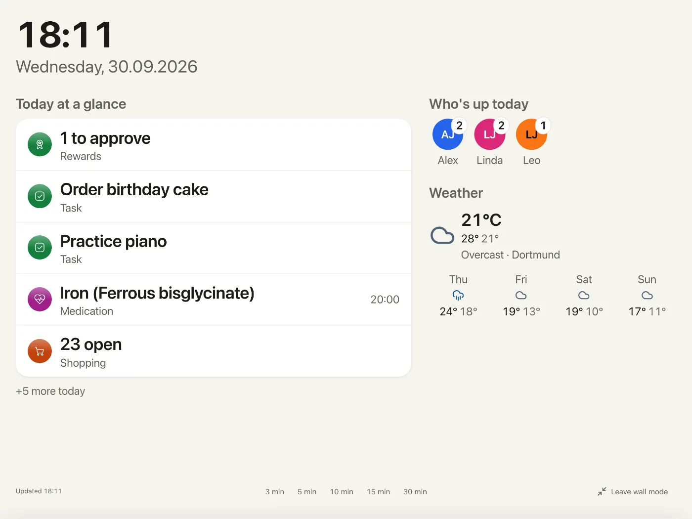
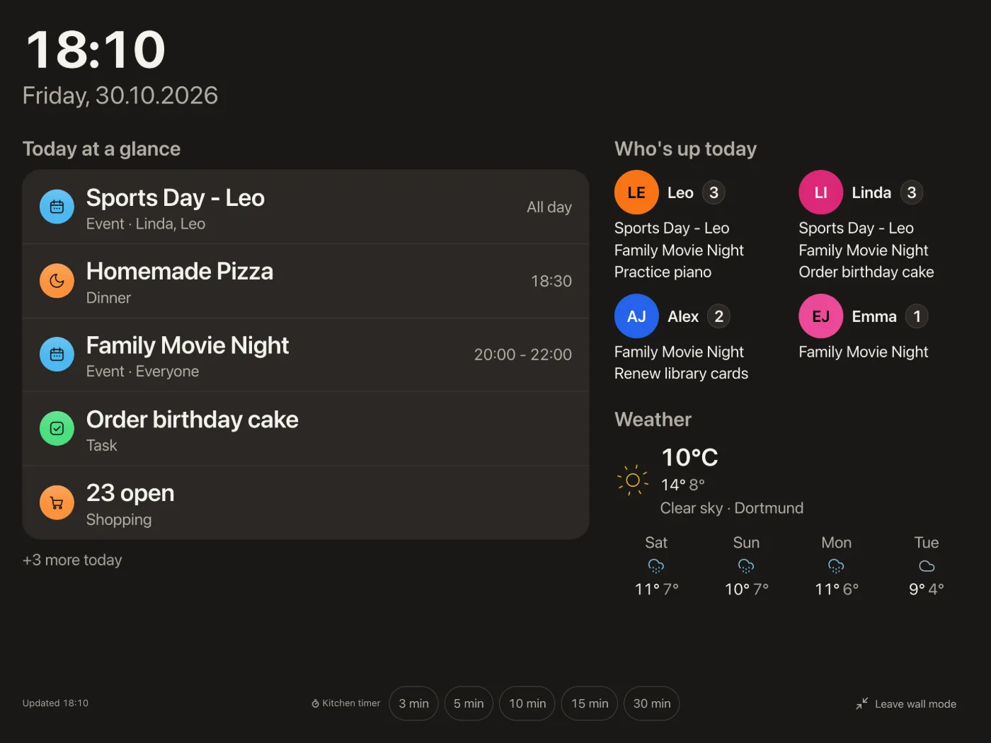
The screens are staged instead of pasted in: the top of the page shows the desktop, the kitchen
wall tablet and a phone together, each connection between two parts shows both ends as real
excerpts from the app, the day at home shows each moment as a focused crop, and the overview,
wall and health screenshots are current again. On a phone the page is nearly a third shorter.
The top bar is the same on every page of the site and groups the jump menu, language and theme in
one glass control: EN and DE are two buttons, and pressing the language you are already reading
no longer switches to the other one; the theme names its mode on wide screens, and GitHub is a
single icon. The jump menu marks the section you are in. The floating Install button on phones
gets out of the way while you scroll down and comes back when you scroll up, and stays away over
the setup section and at the end of the page; "Back to top" appears only after half the page.
The family section shows the kitchen wall tablet large, with the shared notes board on a phone in
front, device frames stay visible in dark mode, and the excerpts are sharp on high-density phone
screens. The overview image at the top now starts loading right away on phones too, and the
footer says "MIT-Lizenz" on the German pages.
Security
- Channel routes only manage household channels. The admin routes for notification channels now
always create a household channel, and a personal channel cannot be pointed at a member through
the admin API or changed by it. A member's private reminders stay out of reach of anything an
admin sets up, in line with how private entries already work.
Fixed
- A reminder you have already seen stays seen when its event is saved again. Saving the reminders of an
event replaced all of them, so one that had already fired came back unread with a new id and showed up
again. A time that stays in the set now keeps its row, its read state and its push state; only new times
are added. - Tasks starting today show up on the household's today. The task list and the MCP
list_taskstool
hid tasks by start date using the server's own day instead of the household time zone, so near midnight a
task could appear a day early or late. - The API refuses malformed task, shopping and calendar input with 400. A number as a title or item name,
nullas a task category or priority, ornullas a category when editing an item ended in a server error.
Numbers in text fields were stored as text such as "5.0", an empty title was saved when editing a task or
event, editing an item checked no lengths,is_checked: "false"ticked an item off, and empty date fields
of a task were stored as empty text instead of no date. These now answer 400 or are stored as no value;
is_checkedstill accepts 0 and 1. Clearing checked items of a list that does not exist answers 404
instead of 200. - Saving a recurring event no longer moves its reminders. In the calendar view, every occurrence named
the last occurrence in view as the start of its series. The event dialog then showed a lead time weeks
too long, and saving wrote that lead time back, so a reminder could fire weeks early. Saving a series
from an external calendar also moved reminders nobody had changed onto the opened occurrence. Reminders
already moved by this stay as they are: if one looks wrong, set it again. - A shared event reminds a household channel once. An event assigned to several people sent the
same reminder to a household notification channel once per person. The channel now hears it once,
and a reminder someone set for a different time still arrives on its own. Each person's Web Push
and personal channels are unchanged. - A waste pickup reminds a household channel once. Everyone who turned on a reminder for the
same waste type sent the same pickup to a household notification channel once per person. The
channel now hears it once, and someone with a different lead time still gets their own message.
Each person's Web Push and personal channels are unchanged. - The Budget title stands in full on narrow phones (#2440). Below 390px wide the title sat next
to the month stepper and read "Bud..." at 360px. There the month now takes a row of its own under
the title, with the arrows at the ends of the row, and the title keeps its size. The tabs without
a month use the same row for their note, so the tab bar stays put between these tabs, and paging
through the months moves nothing. From 390px up nothing changes. - Error messages in Settings speak your language. Saving, syncing or removing something in
Settings could show the server's or browser's raw English sentence in a toast. Now the app says
it in your language, and names the cause where it knows one: the last administrator, a tag or
subscription that is already gone, an Outlook series with exceptions, or location access turned
off in the browser. Only what another server answered, such as a WebDAV or CalDAV server refusing
a connection, still appears as its original text, inside a translated sentence, so an admin can
fix it. - "Today at a glance" fits narrow phones again. On a phone, the summary next to the title
("2 events left · 1 task overdue") was not allowed to wrap. When it did not fit - in German
already on a 375px screen - the card's content became wider than the card and every row was cut
off at the right edge, including "All day" and "Overdue". The summary now moves below the title,
right-aligned, when there is no room beside it, and the card's column never grows past the card
(#2297). - The Tasks title stands in full on narrow phones (#2425). Below 390px wide the title sat next
to three buttons and read "Aufgab…" at 360px. There the filter now moves into the "..." menu, and
the number of active filters stands on the "..." button and in the menu entry. From 390px up
nothing changes. - Repeating tasks keep their time on CalDAV servers across clock changes. A repeating task with
a time now goes out in the household's time zone, so a daily 07:00 task stays at 07:00 after the
clocks change, and a weekday repeat near midnight stays on its day. Its start now lies before its
due time, which strict servers require. Yuvomi fixes a task already on the server the next time
you change it. If another app added a reminder or skipped a date there, the task keeps its old
timing until you tick it off, so those still line up. - A new app name reaches installed apps. After renaming the app in Settings, a browser that
had loaded the app before kept the old name for the installed app, even after uninstalling and
installing it again: the service worker answered/manifest.webmanifestfrom its cache and only
asked the server after the next release. It now asks the server first, like it already did for
manifest.json, and uses the cached copy only when the network is slow or offline. - Vitals take the units Yuvomi can convert, and impossible values no longer slip past in them
(#2375). The API took any text as a unit, so 9,000,000 g went past the limits that stop 9,000 kg,
and a typo likekgswas drawn unconverted next to kilograms.POSTandPATCH /api/v1/health/vitalsnow accept the units a measurement lists plus those the chart can convert,
in any capitalisation (weight alsog,lbsandstone, height and head circumference alsom
andmm, temperature alsoCandF), and check the limits on the converted value: 700,001 g
is refused like 700.001 kg. Any other unit is refused with 400 and the reason
health_vital_unit_invalid, and the message names the ones that work. Weights in stone now also
convert in the chart.unitstays optional, stored readings stay as they were sent, and older
readings in any unit can still be edited. - A calendar series that gets a new first date on its way out keeps its exact time. When Yuvomi
moves the start of a series like "last day of the month" onto the first day the rule hits, fractions of a
second that came from the calendar provider were dropped from the start and end. They now stay. - The container starts with
no-new-privileges. Hardened setups (Podman Quadlet
NoNewPrivileges=true,--security-opt no-new-privileges, Composesecurity_opt) never got
past the entrypoint:gosuhung as root at 100 % CPU before it switched to thenodeuser, so
the server did not start (#2380). The entrypoint now drops tonodewithsetprivfrom
util-linux, which is already in the base image, and setsHOMEto node's home asgosudid.
Thegosupackage is gone from the image. Starting as root without the option, or directly as
node, works as before. - Reset to original restores a subscribed event at once. Resetting a changed event from an ICS
subscription only cleared the edit mark, so the changed text stayed until the next sync. Each sync
now keeps the feed's values, and the reset restores them straight away, without a network call.
Subscriptions synced before this update have no stored values yet: their reset clears the mark
and says so, and the next sync fills them in (Refs D#2330). - Calendar responses no longer carry internal sync state. The event data sent to the app
included the snapshots Yuvomi keeps to match calendar syncs. The app never reads them, so they
are gone from the responses now; nothing you see changes. - Tasks remember how you group them. Grouping the list by due date instead of category now
stays after a reload, on that device, like the choice between list, board and history. - The Podman Quadlet health check passes. The
HealthCmdintools/quadlet/oikos.container
reached Podman as a shell command with a missing closing quote, so every check failed with
Syntax error: Unterminated quoted stringand the container stayedunhealthyalthough the app
was running. The quotes are swapped - single quotes around thenode -eargument, double quotes
inside the JavaScript. - The end of a long recipe list stays reachable on the iPhone. The last recipes used to sit behind the
bottom menu and sprang back out of reach when you let go. The list now ends above the menu, and
the bounce at the end of a list no longer brings the search row back. The same holds for the other
kitchen lists. - A meal stays on the wall until the next planned meal. Since 2.83.0 "Today at a glance" dropped
a meal the moment its slot began, so breakfast was gone at 08:00 and dinner at 18:30. A meal now
stays until the next meal planned for today starts, and the last one until the end of the day.
The smaller Today sheet on phones and tablets follows the same rule, and the timeline dot is
unchanged. - Vietnamese counts show the real number. In browsers with current language data, Vietnamese
picks the singular wording for 0 as well as for 1, so eleven messages such as the active filter
count said "1" when nothing was selected. They now show the actual count. - The website no longer says contacts sync both ways. Contacts come in over CardDAV and are
not written back; the homepage and the install page promised a two-way sync for them. - Running the web installer again keeps your settings. On an existing installation the advanced
setup now fills its fields with the values from your.env- port, public address, reverse-proxy
settings, timezone, weather, email, sign-on, storage and backups - so a second run no longer resets
them to defaults when you only wanted to add something. A hand-tunedTRUST_PROXY=2stays as long
as you keep the pre-selected access choice, and the review page shows the kept values instead of
"Not set up". Passwords, client secrets and keys never reach the browser: their fields stay empty
with the note "Current value is kept", and the existing values are written back. Lines you leave
unchanged stay exactly as written, inline comments and quotes included, and a secret read from a
file (GOOGLE_CLIENT_SECRET_FILE,SESSION_SECRET_FILEand the other_FILEvariables) counts as
kept instead of being written a second time, which stopped Yuvomi from starting. A setting you
leave as it was is no longer checked against the installer's stricter rules either: a port or
address written as a Compose variable (${HTTP_PORT:-3000}), a backup schedule with a seconds
field or a full weekday name, and OAuth redirect addresses registered under a different host all
stay as they are until you change the address or the client. - The simple setup makes Yuvomi reachable on your home network. It used to write
http://localhost:3000as the address, so invitation and password-reset links and the app on
your phones pointed at a device that could not be reached. It now uses this computer's address on
the home network (for examplehttp://192.168.1.20:3000), skips Docker bridges and VPN tunnels when
looking for it, and lets you change it with "Change". If it finds none, it says plainly that Yuvomi
is then reachable only on this computer. - A public address without
http://orhttps://is refused in the installer instead of being
silently replaced by an address derived from host and port. - The installer catches settings the server would reject before saving them. A backup schedule
like99 * * * *used to pass and then switched backups off at startup; the schedule is now
checked field by field (minute 0-59, hour 0-23, day 1-31, month 1-12, weekday 0-7). Google,
Outlook and iCloud need their ID and secret together, WebDAV switched on needs its URL, the
document folder inside the container must start with/, and theREPLACE_WITH_placeholder
from.env.exampleis no longer accepted as a key. A failed key generation now shows a message
instead of leaving the key fields silently empty, and the start screen no longer piles up status
requests when the server answers slowly. - Clearer wording in the installer. The key warning is now a calm notice that says what happens:
you get a key file (.env) at the end, and without the database key your data is lost. It used
to be a red alarm that asked you to save the keys "now". The start screen talks about
downloading, starting and checking Yuvomi instead of images, containers and health checks, the
start button reads "Save & Start Yuvomi" for Docker and Podman alike, and the iCloud row no longer
carries a "Legacy" label. - The installer's step count matches its step list. "Start Yuvomi" is now a numbered step like
the others, so the list and "Step N of M" count the same steps: the advanced setup used to show
"Step 8 of 9" next to ten entries, the simple setup "Step 1 of 2" next to three. - How you reach Yuvomi is a two-way switch in the installer instead of a drop-down with two
entries, and the home-network switches in the advanced step form their own named group, so screen
readers announce the warning above them. On the review page, anything not set up says so in its
own row ("Not set up") instead of one row that listed the missing services in the value column. A
failed save now reads "The settings could not be saved." instead of naming the.envfile. - The installer opens faster and in your language right away. The language files load in
parallel and the scripts are fetched with the first byte, the page stays hidden until it can show
your language (with a safety timeout), and HTML, scripts and language files go out compressed:
about 160 kB instead of 520 kB per visit. Every response now forbids embedding the installer in
another page (it shows your keys) and sends no referrer, and the browser tab shows the Yuvomi icon
instead of a missing-icon error. - Installer fields behave like the app's. Address fields open the URL keyboard on phones and are
no longer capitalised or spell-checked, ports open the number pad, and the Enter key on the
on-screen keyboard says "Next". A field the browser itself recognises as invalid (an address
withouthttps://) turns red after you leave it, and screen readers hear the same. Long labels
on the review page ("Database encryption key") are hyphenated instead of running into the value,
addresses like./dataread correctly in Arabic and Persian, and the page no longer puts a focus
ring on the first heading when it opens. Field borders, the main button and the browser bar now
match the app, and the language picker on phones is only as wide as the language it shows. - No more long dashes in the installer's texts. All 27 languages of the web and command-line
installer use a plain hyphen, also for ranges and negative numbers. - Emptying a field when you run the installer again removes the setting. A pre-filled value you
clear (for example the weather city or the sender name) used to come back from the old.env; it is
now removed, and the review page lists it under "Will be removed from .env". Fields you leave
alone, passwords and keys are never removed this way. - The installer asks for a second click only when it replaces something. A first installation
saves and starts with one click; with an existing.envor a running container the confirmation
stays, and a line above the button now says what you confirm - the old.envis replaced after a
backup, the running container restarts, or both. - The advanced setup also starts with your home-network address. Like the simple setup it fills
in this computer's address on the home network instead oflocalhost, and the review page says
calmly when an address is reachable only on this device. - Backup schedules the scheduler would never run are refused. A day that no chosen month has
(0 3 31 2 *, February 31) used to pass and switched backups off at startup. The message now also
names the six-field form with seconds and shorthands such as@daily. - Copying in the installer says when it did not work. If the clipboard refuses, the value is
selected for manual copying and the note says so, instead of claiming "Copied". - Browsers no longer offer saved passwords in the installer's secret fields. Calendar, sign-on
and app-password fields are marked as new secrets, so a password manager does not fill in an
unrelated login. - The installer's last screen leads with the success. One check mark says Yuvomi is ready, and
saving the key file is a quiet checklist row that ticks itself off after the download, instead of
a warning banner, a second logo and a download button above "Open Yuvomi". The note that the
installer shuts down soon stays as a small line until the file is saved. - Skipped steps look skipped in the installer's step list. Weather, calendar, email, storage and
advanced steps you leave empty show a dash instead of a green check mark. - Installer fields match the app's. Fields are 48 pixels high on the app's field background, the
show-password and copy buttons are full-size touch targets, the Yuvomi mark in the header looks
the same as in the app in dark mode, and hovering the advanced option no longer pulls harder than
the recommended one. - Clearer installer messages. A missing field in the admin step is named and focused instead of
"All fields are required", a server's own error text appears as a separate "Details" line, the
example values in the address and name fields are in your language, the start screen says that a
first run usually takes 1-3 minutes and counts in minutes, and technical terms like "session
secret", "SSRF protection" and "Compose file" follow a plain description instead of leading it. - Installer hints read at a calmer line length. Explanations under fields wrap at about 80
characters instead of 90, spacing follows the app's scale, a failed copy shows its note on its own
line instead of breaking around the button, and the "taking longer than usual" note no longer
touches the line above it.
AI summary Secrets can now be read from files
Added
- Secrets can be read from files (
<NAME>_FILE).SESSION_SECRET,DB_ENCRYPTION_KEYand the
other secrets (client secrets, passwords, API keys) can now come from a file instead of an
environment variable: setSESSION_SECRET_FILE=/run/secrets/session_secretand the content of that
file is used, the same convention as the official postgres and mysql images. That keeps the value
out of.env, the compose file anddocker inspect, and works with Docker and Podman secrets or a
Vault Agent without a wrapper around the entrypoint. Setting both<NAME>and<NAME>_FILEstops
the start, and so does a missing or empty file: falling back would be harmful for
DB_ENCRYPTION_KEY, where the app would otherwise start on a new, unencrypted database. Only line
breaks at the end of the file are removed. The app reads the file as the user it runs as - uid
1000 in the image, 568 on TrueNAS - not as root, so the file needs that owner and mode600; a
file that other users can read and that is not read-only, such as one written by a plainprintf,
logs a warning at start-up. The
list of supported names and how to create the file are in the environment variables reference. - New tasks remember your preferred visibility and lock setting (#2125). In Settings > Tasks
you can now choose the visibility and lock state that the new-task dialog opens with. Each
individual task can still use different values; the defaults only prefill the dialog. - Recipes know their servings. A recipe can say how many servings its amounts are for, and its
ingredients get a "Servings − 4 +" stepper that recalculates every amount as you step. Planning the
recipe or putting it on the shopping list takes the servings you chose. In the meal dialog the same
stepper replaces the "Scale ingredients" number field once a recipe fills the list. A recipe without
servings steps in multiples ("Amount × 1.5") instead of inventing a number. If someone changed the
recipe in the meantime, the transfer shows the new ingredients and asks you to add them again,
instead of putting an amount on the wrong ingredient. - Shared expenses use your budget categories. An expense in a split group now picks from the same
categories as the budget, shown with the same coloured dot, instead of a separate list of twelve with
icons. Existing expenses keep their meaning where a budget category fits (groceries become Food, rent
Housing, travel Leisure and so on); the rest show "No category". The category filter above the
expenses is a filter button like elsewhere in the budget. A budget category that shared expenses
still use cannot be deleted, just like one with bookings. Over the API,budget_categorysits next
to the oldercategory, which stays as it was.
Changed
- The document viewer on a phone has one line above the document. Open in a new tab, Edit, Share
and Download sit in the "..." menu next to the category and the arrows, with their names, instead
of a second row of buttons - the document starts about 56 px higher. Wider screens keep the row. - A shared expense shows itself before it edits. Tapping an expense opens a read view with Edit as
the one main button instead of the form with the keyboard up. The expense and recurring-expense forms
start with the amount, with the currency chosen right inside the amount field; date and payer share a
row, people are picked with the same name chips as elsewhere, and notes and receipts sit under "More
details". "Add" can always be pressed and says what is missing (nobody selected, shares that do not
add up) at the field instead of staying grey. - A booking shows itself before it edits. Tapping a transaction opens a read view (amount, date,
category, account, receipts, repeat) with Edit as the one main button, instead of the edit form. - An account shows itself first. Tapping an account opens a read view (type, balance, starting
balance, and bank and limit for credit cards) with Edit as the main button and "Show transactions"
beside it, instead of leaving the Accounts tab. From the statement, the account chip's × leads back
to Accounts. - Transfers, loans and accounts use the same money form. A transfer's amount shows its currency
in the field, "From" and "To" sit side by side, the title may stay empty (it is then named after both
accounts) and category and repeat sit under "More details" - switching the entry type no longer makes
the dialog jump. A loan asks for direction, person, amount and instalments first and keeps title,
account, currency and notes under "More details". The starting balance and credit limit of an account
show their currency, and account and category colours use the same colour row as the rest of the app. - Accounts, loans and subscriptions lead with one line of figures. Instead of a column of cards
next to the list, each tab shows its main figure at the top in every width - net worth, remaining
debt, monthly subscription cost - with at most two companions beside it ("Over budget 23.60 € ·
Yearly forecast 1,363.20 €"). The subscription side column keeps only the forecast and breakdowns.
An account row no longer repeats its starting balance (it is shown when you open the account), the
loan filter starts at the edge of the list, and a loan card says its next and last payment in one
line. - Statistics have one place for time. Week, month or year is chosen right next to the period in
the header ("October 2026 · Month ⌄"; on phones as the first line of the statistics) instead of a
second switch below it, and amounts under "Expenses" and "Income" no longer carry a minus or plus -
only the change against the previous period does. - A subscription shows itself before it edits. Tapping a subscription opens a read view with
"Mark as renewed" and Edit. In the form the currency is chosen inside the amount field, the next
payment sits with the billing details, and the logo tile itself picks the image. The row no longer
lists the payment method and the standard "3 days before" reminder in every line. - Uploading a document is quieter. The upload dialog no longer puts the cursor in the name field
(the file comes first and names itself), the explanations under name, category and folder sit behind
"Learn more", and the storage location is a plain sentence instead of a link out of the half-filled
form. People who may see a restricted document are picked with name chips. In the document viewer,
Open, Edit, Share and Download carry their words (on phones Download keeps its word and the others
show as icons), and "Add" in the receipt picker can always be pressed and says when nothing is chosen. - The inventory leads with one line. Items and total value stand as one line at the top in every
width instead of three tiles, and "Needs attention 1" is a filter chip that shows exactly the items
with an upcoming deadline - it only appears when there is one. - Notes filter by person with faces. The "Created by" chips above the notes show each person's
colour and initials with the first name, like the person filters in the calendar and tasks. In the
note editor, Read and Edit are plain words, the category type has a visible label with its
explanation under "Learn more" instead of an info tooltip, and the text field no longer shows a
resize handle. - One balance sentence. When a group has a single open debt that involves you, the figure at the
top says it with the name ("You owe Alex Johnson 24.14 €") and the balances list no longer repeats it;
the "Balances" heading then goes too, and "Settle up" stays right below the figure. - Tapping a meal shows it first. The meal card opens a read view (date, meal, cook, ingredients,
recipe, notes) with Edit as the one main button and "Add to shopping list" next to it, instead of
the full edit form. On a computer it opens next to the card. In the form, a meal's ingredients are
always a short list with "Adjust", no longer a fold in some meals and a list in others. - The meal plan keeps its recipes close. The recipe strip follows the week instead of sitting at
the bottom of the window with an empty band above it, starts folded on low screens, and its tiles
show the number of ingredients (and the picture where there is one). Meal names on the week board
use up to three lines before they are shortened, the two card icons share one quiet colour, and on
phones a day reads "Wed 28.10." with the plus at the end. The week board is as tall as its meals:
cards without buttons end below their name, an empty slot is only as tall as its plus, and the
meal-type lines sit closer to their row - at 1024 x 768 a whole week down to the snacks fits
without scrolling up and down. - The pantry says everything in one line, in the same order. "2 days left" and "Running low" now
follow the quantity under the name ("1 l · 3 days left · Running low"), instead of floating next to
the name. On phones the best-before date moves to its own line instead of disappearing, and the side
column that listed the same expiring items again is gone - the filter chips carry the counts. A tap on- or − briefly highlights the quantity it changed.
- Recipes are calmer. "Planned this week" only appears when not every recipe is planned, editing a
recipe shows each ingredient in one row on wider screens, and "Match 6 ingredients to the pantry" now
reads "Link 6 ingredients to your pantry". - Shopping item details are shorter. Price, store, link and note sit under "More details" (open
when one of them is filled in), the category has the full width on phones, and opening an item no
longer brings up the keyboard. The quick-add row is as tall as the rest of the header and sends with
an "Add" button instead of a bare return arrow; its fields and the button share one height (on a
phone the name field was 2 px taller than the button). "Add from meal plan" can always be pressed and says
at its preview line when the range has nothing to add. "To pantry" starts with "Choose a place …"
instead of pretending every item goes to the first place. - Waste collection is calmer. Today's pickup carries a "Put out today" label instead of the same grey
"Today" as every other date. Types without a schedule share one card ("No schedule: Recycling, Organic,
Glass") with a single "Add schedule" button instead of one card each repeating "No schedule yet", and
a type card has one "..." menu - the schedule row opens its dialog, where Delete is. - A new waste schedule picks its weekday. The weekday of the first pickup is selected and follows
that date until you pick a day yourself, so you no longer get "Choose at least one weekday" after
pressing Add. "Active" only appears when editing a schedule. - Waste messages name the type. Archiving, restoring and deleting a schedule or pickup now say which
waste type it was. - Household help's visits show what is still open. An unpaid visit carries a "Pending" label next
to its date and a "Paid" button at the end of the row, so marking it paid is one tap instead of a trip
through the "..." menu. The payments card shows a chart only once there are two months of payments;
with one month it says the total and how much is still open. - Household help's numbers sit on top. Reports shows the open amount as one line above the visits,
with the number of visits and the paid amount next to it, instead of three cards at the side; the
chores tab no longer repeats "Due" and "Done this month" next to the list. The Visits tab does the
same in every width: one line with the visits this month and, when there are any, the chores due
and done, instead of four tiles on a computer and a fold on a phone. "Last visit" is gone from it -
it is the first visit in the list right below. - The household help form is shorter. Name and billing (type, rate, payment rhythm) come first;
phone, e-mail, birthday, colours and notes are under "More details". Adding a chore suggests the
areas you already use, so "Kitchen" is not created twice, and the suggestions say that a tap adds
them right away. - Rewards has two tabs: Points and Rewards. The history is one level below Points: "History ›"
opens it with the person filter, "‹ Points" (or the Points tab) goes back. Before, Points showed the
history at its side and History showed the points at its side - the same two blocks on two tabs. The
history has its own address (/rewards/history): the browser's or the phone's Back returns to Points,
and reloading or opening a link lands in the history. - A bonus is a credit or a deduction. The bonus dialog has a Credit | Deduction switch and a plain
number, and its button says "Credit" or "Deduct" instead of "Save"; before, you typed a minus sign
to take points away. Redeeming with too few points is no longer a greyed-out button - it says why. - Pocket money is offered for the children. "Set up pocket money" no longer lists parents and
grandparents; members without a family role stay available. "Manage participants" is a button with
its name, like "Set up pocket money" next to it, instead of a "..." menu with a single entry. - A task's comment box is one line with the send arrow inside it. It grows while you type, has no
resize handle any more, and the separate "Comment" button below it is gone, so on phones it no longer
sits half under the sheet's buttons. Cmd/Ctrl+Enter sends. The priority in a task's details now reads
in the same size as status and category. - Subtasks are tidier. A task with subtasks shows "1/2" with a small arrow in its detail line instead
of a full-width progress bar; tap it to unfold the subtasks, which now sit indented under the task's
title. "Add subtask" is a quiet row with a plus, in the list and in the details. - The task board says what its buttons do. Each card's button reads "Start", "Finish", "Reopen" or
"Restore" on wider screens, an empty "Archived" column is only as wide as its header, and on phones the
dots above the board are tabs with each column's name and count. The filter button no longer shows
greyed out in History; its place stays free so nothing in the header moves. - Finishing a repeating task names it. The message reads "“Water the plants” done - next due
4 Nov" instead of just "Done - next due 4 Nov". - The wall display shows the day's appointments first. "Today" on the wall lists all-day events,
then appointments and meals by time, followed by the rest, the same way the overview does.
Before, open tasks could push the evening's appointments out, and a smaller tablet showed different
rows than a large one. The kitchen timer buttons are larger outlined buttons, easier to read and hit
from a distance. - A new birthday says what happens to it next to the date. The note that every birthday goes to the
calendar and reminders now sits under the date field instead of above the buttons. - The shift plan's overview works like the calendar's week. The week, the Week/Day switch and the
people button sit in the page header, next to the title on tablets and computers and under the tabs on
phones, instead of in a strip above the grid. The grid scrolls on its own under the day headings, and
the header folds away while you scroll it, like in the calendar and the budget; on a computer the grid
starts 56px higher. It still opens on the current hour, now with the full header in view, and that
hour is no longer hidden behind the tab bar on phones - in the calendar's week and day view neither.
A running shift keeps its name at the top of the grid while you scroll. - "Today" in the shift plan is in the overview grid. The row of today's shifts above every tab is
gone; the overview shows today in its grid, and shift types, planning and statistics start right with
their content. - Planning rows name the shift. Exceptions and extra shifts show the shift ("U · Vacation") as the
row title, with date and person below. The quick templates under the shift types say what they do
("Add typical shift types:") and are small buttons, and the week in the overview reads in the same size
as other periods. - The weather is under the date on the desktop too. The overview shows the current weather below
the greeting in every width, as it already did on phones. The weather card stays optional for the
forecast. - Shifts in the calendar's week and day are narrow bands. A shift with a time now shows as a slim
coloured band at the edge of the day, with its short label running along it, instead of a block across
the whole column. Appointments during the shift start right next to the band and stay readable;
appointments outside it keep the full width. Tap the band for the shift's details. - Managing calendars is a list. "Calendars" shows each calendar as a row with its colour dot, name and
number of appointments. Tap a row to rename it or pick its colour from the family colours or your own;
"+ Calendar" adds one the same way. A link at the bottom leads to subscriptions and sync in Settings. - An appointment's colour has "Custom". Next to the calendar colours, the colour row in the
appointment form now offers your own colour, like every other colour choice in the app. - The month reads more calmly. Days from the previous and next month keep the background of their
weekday and are dimmed by their number, so they no longer look like weekend days. On phones the selected
day is a tinted cell instead of a dark ring around the number, so today's filled circle stays clear. - Resetting a changed subscription event is in the "..." menu of the appointment, with its name.
- Taking a medicine is a tick. Due doses and as-needed medicines now have a circle in front of the
name, like a task: tap it and the dose is taken, with Undo in the message. A taken dose shows a full
circle. Before, every due dose carried a filled "Take" button, so a Health page could show three main
buttons at once; "Skip" stays in the row's "..." menu. - Approving a reward request is one quiet button. Each open request shows "Approve" as an outlined
button and "Reject" in its "..." menu, like the pocket money row next to it. Before, two requests meant
two filled buttons on the page. - Delete looks the same everywhere. Recipes, inventory, contacts, birthdays, notes, tasks and
appointments show Delete as the red outlined button with its word, like every other dialog. Exporting a
contact as vCard and duplicating a recipe moved into the "..." menu at the bottom of the sheet, where
they keep their names instead of showing a bare icon on phones. - Selecting several items has bigger buttons. The bar at the bottom ("Done", "Delete", "Finish")
uses buttons as tall as the other small buttons, with larger text, in tasks, shopping and every list
with multiple selection. - Labels look alike. Task tags, the shopping list's synced labels, note categories and the badges on
medicine cards share one quiet label style. Note cards have the same rounded corners as other cards,
and their checklist circles are the size of the task circle. - Controls on the desktop have one size. The person picker in Health, the section menu in Rewards,
"Check out" in Household help and "Compare people" in the shift plan now match the other buttons
instead of standing a few pixels taller. - Waste type templates are buttons. The quick templates for a new waste type look like small buttons
with their symbol in the type's colour and fit on one line on the desktop, instead of looking like
filters. - "In my navigation" is a switch. Settings > Navigation shows a switch per module instead of a
crossed-out eye; on means the module stays in your navigation. The page description now reads "Order
and your own view". - The profile picture is chosen with one control. In your account and when editing a member, the
picture itself is the button with a small pencil badge; "Remove picture" and "Use my Gravatar" are text
buttons below, and Remove only appears when there is a picture. Setting up two-factor sign-in is a
secondary button, so the account page has one main button per card. - Every Health view has its add button. The overview's "+ Record" opens a short menu at the button
(measurement, workout, dose, cycle), and the cycle area's "+ Day" logs today. Before, both views had
no button and phones showed an empty spot at the end of the tab bar. "Period started" in the cycle's
today card is now a quiet button next to it, and the workout dialog says "Log workout" like its button.
On the desktop the person picker no longer shifts sideways when you switch areas. The overview's
"Quick capture" card is gone - the menu at "+ Record" offers the same - and preventive care is called
"Preventive care" on its button and in its dialog ("Add preventive care") instead of "Checkup" and
"Add entry". - Health dialogs ask for the important thing first. Logging a workout puts you on "Type" instead of
the date, and preventive care marks its name as required when no type is chosen. Recording nutrition
shows name, time, meal and energy; fat, carbohydrates, protein and the rest sit under "More details",
which names what it holds - as in the medication and preventive care dialogs. Editing an existing entry
no longer brings up the keyboard on phones. Without any entry and without a daily goal, Nutrition shows
one empty state instead of the goal hint above it. - Roles and permissions are one line per module. Each module shows its access as a value on the
right ("Full ⌄"); widgets and extra permissions open under "Widgets and more permissions" in the same
form. A change is saved right away with Undo in the message - there is no Save button any more and
nothing to discard. The page is about half as long. API tokens choose their module limits the same
way ("No access / Read / Write" per module) instead of a table of tick boxes. - Contact categories fit. When the category chips no longer fit next to the list (on the desktop
beside an open contact, on phones from the third chip) or there are more than four, a "Filter" button
takes their place and shows the categories in a sheet - the same filter as elsewhere. The import
dialogs for contacts and birthdays no longer grey out "Import" before you choose; they say "Please
select at least one contact." at the dialog instead. "More details" in the contact form names what it
holds, and editing a birthday, quick link or address book account no longer brings up the keyboard on
phones. - Editing an event, a note or a custom shift field no longer brings up the keyboard on phones. The
sheet opens with its title focused, as everywhere else. Adding an extra shift before any shift type
exists keeps "Add" pressable; it points at the missing shift types instead of staying grey. - Health vitals have one time line. Day, week, month or year is the same switch as elsewhere in the
app, and the period arrows sit in the same line instead of above the chart - activity uses the same
line for its week. The vitals chart keeps its height on wide screens (two charts of 200 px instead of
270 px for blood pressure and pulse), the pulse is drawn in the Health colour on its own axis, the last
tile no longer leaves empty cells next to it, and the overview's tiles show the same trend line as the
vitals area. - Lab results pick their trend by name. Tap an analyte in a report to see its trend below, instead
of choosing it from a list under the table. A low or high value carries its arrow and word right at
the value, so the mostly empty "Assessment" column is gone, and "Edit" is a regular small button. The
cycle view no longer shows the next period twice - the ring says when; a tile only appears for the
range around menopause. - Pick your fasting goal before you start. When no fast is running, the fasting card shows the goal
(none, 12:12 up to 23:1, custom) right above the buttons, so "Start fasting" runs with the goal you
see instead of "No goal" from a setting two steps away. Adding a past fast has one place: the empty
state while there is no history, the card's "..." menu once there is. - The Health overview starts with today. On phones "As needed" now stands right below "Due today",
before the list of areas, instead of behind "Show all values"; the card with the two latest
measurements is called "Last measured". On the desktop an area's name stands above it without a card
of its own, and the overview no longer repeats "Overview" next to the list. In the person menu "Me"
comes first. - The active tab looks the same in light and dark. Budget, Rewards, Household help, Shift plan,
Kitchen and the shopping lists mark the current tab with a soft capsule in the module's colour. In light
mode it was a white capsule with a grey ring that looked like a button. - Headers line up across modules. On phones every header with a tab row has the same height, so the
tabs no longer jump by a few pixels between Budget and Rewards. The header menu is always the "..."
button (Documents showed two arrows), the Documents view switch is as wide as the buttons beside it,
and Tasks shows either the view's icon or, on wide screens, its name - never both. The Overview's tools
and "+ New" stand at the same height as in every module, and on phones "Today" starts higher up. - A settings page on the phone starts right under its header. The header shows the back arrow, the
page's own symbol and its name in large type in one bar; the separate "Settings" row, the gear and the
description below it are gone, so the first card moves up from about a fifth of the screen to just
below the bar. The jump links at the top of long pages stay one row on every screen width, and the
three bottom-bar positions in Navigation are one card with a row per position. - The budget plan's button says what it adds. It reads "+ Category budget" instead of repeating the
module's name. - One way to pick a colour, everywhere. Shift types, the household help's calendar and profile
colour, subscriptions and their categories, new calendars, calendar subscriptions and imports,
holiday colours, member and account colours, waste types, notes and quick links now offer the same
row of named family colours with "Custom" behind it for any other shade. Before, some showed a bare
violet colour bar, some a round colour button and some their own swatch row. A colour you set earlier
that is not in the row stays selected as its own swatch instead of being replaced. - A shift type reads like an appointment. Start and end stand side by side in one row, and a shift
type without a symbol shows a plus on "Choose symbol" instead of a crossed-out picture. - A repeat interval reads as a sentence. Waste collection, subscriptions and the household help's
chores now ask "Every [2] weeks", "Every [1] [months]" and "Every [7] days" with the number inside the
sentence. Before, waste collection labelled the field "Every N weeks", subscriptions showed a search
field for the billing cycle next to a lone "Every" over a number, and chores asked for a bare number of
days. The sentence follows the number as you type - "Every 1 week", "Every 2 weeks" - in every
language, including the forms Czech, Polish, Russian, Ukrainian and Arabic use for 2-4 or 5 and more,
and a subscription's line in the list now says the same words. - A birthday photo is chosen with one control. The photo itself is the button, with a small pencil
badge; the separate pencil button next to it is gone, and "Remove picture" appears as text below only
when there is a picture. - Adding another phone number or email is a quiet line action. In a contact, "+ Add phone number"
and "+ Add email address" stood as full-width buttons in the middle of the dialog; they now sit small
at the edge of the fields. - Filtering by person looks the same in every module. The task history, the rewards history, the
task filters and the calendar show one row of chips with each person's colour, initials and first
name, with "All" in front. On phones the task history showed only initials without names, and on
desktop it cut names off ("Leo Joh…"). - Headings in the settings keep their size for everyone. A section such as "Event defaults" stood
smaller for adults than for children, because "For me" and "For the household" sat above it as a
larger heading. Those now read as small group labels, like the groups in the settings list, the
overview on phones and the module groups in "Active modules" and "Navigation", and every section keeps
the same size. - One number leads, the others step back clearly. Next to the leading figure (balance, outstanding
loan, monthly cost), income, expenses and the other figures stand one size smaller than before, the
same size on every tab and on phones. - Amounts look the same in every list. Account balances, budget plan values and loan instalments
now match transactions in size and weight; a loan's or subscription's amount no longer stands bolder
than the rest, and the plan's limit stands quieter next to what was spent. - Detail titles and calendar blocks read as one system. The name of a selected task, contact,
recipe, item or health area stands a step larger above its details, the health charts and recent
measurements carry proper subtitles, and the documents' folder column has a real heading. In the
calendar's day and week view a shift block shows its name and time like an appointment, name above
time, instead of large text side by side.
Security
- A member colour can only be a colour. Your profile, member management and the
housekeeper form accepted any text as a member colour, and that text ended up in the
styles other household members see, so an account could lay its own styling over their
screens. Only#RRGGBBis accepted now, the app shows nothing else, and a stored value
that is not a colour falls back to the default blue on update.
Fixed
- Recipes mirrored from Mealie bring their steps along (#2363). The mirror took over title,
ingredients and image, but not the preparation steps. The notes of a mirrored recipe now show
Mealie's description followed by the steps as a numbered list, with a step's title in front of its
text. Empty steps are left out. Recipes that were mirrored before are fetched once more on the
next sync after the update, so they get their steps too. - Recurring tasks keep their repeat on a CalDAV server (#2350). A task that repeats in Yuvomi
went to the server as a one-off task: the outgoing VTODO carried title, due date and status but no
RRULE, so Tasks.org, Thunderbird or a Baikal-backed phone showed it once. The rule now goes along
on the first upload and on every later edit, and an end date is written the way RFC 5545 wants it
next to the due date - a plain date for a task without a time, the end of that day in UTC for one
with a time. A ticked-off occurrence goes up without the rule, because the next occurrence is its
own task on the server, and the series starts on the due date (DTSTART, which the standard
requires next to a rule). A series someone set up in another app keeps its rule even though Yuvomi
does not read it in; a rule Yuvomi added to such a task is marked, so switching the repeat off
here takes it away again unless the other app has changed it since. "Repeat from completion"
stays a Yuvomi setting: the standard has no way to say it. - Switching a module on or off no longer doubles "Settings" in the sidebar (#2324). After a
module was toggled under Settings > Active modules, the sidebar showed "Settings" twice until the
next reload. It now stays once, at its place at the bottom, however often the list is rebuilt. - Imported calendars take their new colour (#2303). Changing the colour of a calendar under
"Manage calendars" now also recolours the events that were imported into it from an ICS file in the
day, week, month and detail views. The import used to copy the colour into every event, which then
kept the old one. The colour field of the import now starts on the colour of the chosen calendar;
picking a different one still gives those events their own colour. - Weights in grams and kilograms sit on the same line (#2328). A weight sent over the API in
grams (95400 g) was drawn next to the kilogram readings as a spike at 95400, and the change card
showed +95,304.7. Readings of one kind are now converted to a single unit before the chart, the
average and the change are calculated - the unit most of your readings use, otherwise kilograms.
The same applies to height and head circumference (cm, m, mm, in), temperature (°C, °F) and blood
sugar (mg/dL, mmol/L). The stored readings stay as they were sent. - SMTP with encryption "None" sends without encryption (#2326). Until now Yuvomi still switched
to STARTTLS whenever the mail server offered it, so an internal relay on port 25 with a self-signed
certificate failed with "self-signed certificate". "None" now never upgrades the connection, both
from the settings page and fromEMAIL_SMTP_SECURE=none. "STARTTLS" and "SSL/TLS" are unchanged. - The weather place search no longer promises postcodes (#2353). The field said "City or
postcode", but the place search at Open-Meteo only finds a postcode where its place data happens
to list one: 01099 (Dresden) found nothing, and 10115 (Berlin) even offered New York. The field
now asks for a city or town. - Old daily series show up in the calendar again (#2341). The calendar view counted every
repeating event from its very first day and gave up after 1000 steps, so a daily event that
started more than about three years ago was missing from the month entirely, and every page of
the calendar got slower as the household's series got older. The calendar, the overview and the
upcoming list now start each series just before the days they show. - Amount fields accept comma or point decimals across devices. (#2170) Budget entries,
transfers, confirmations, plans, subscriptions, shopping prices, inventory, housekeeping,
rewards and shared expenses preserve cents even when the keyboard and household number
formats differ. Existing amounts use the household's number format when edited. Currency
precision checks still apply; malformed amounts and ambiguous thousands grouping are
rejected before saving. - The dashboard and calendar are fast again with synced recurring events (#2226). Since the
fix for occurrences on the clock change day (#2034), every occurrence of a repeating event is
placed in its time zone with several lookups, and each lookup set up a fresh date formatter - the
slow part. With a few synced calendars the dashboard took over a second and a half on a fast
computer and several seconds on a small server, and it held up every other request in the
meantime. Each time zone now keeps one formatter, which makes placing an occurrence about ten
times faster. The results are unchanged. - A colour is picked where you tap it. In every colour row (events, notes, categories, accounts,
your own colour) the tap area of one colour reached into its neighbour's, so a tap just beside a
colour could pick the next one. The tap areas now meet without overlapping, each as large as a
touch target, and on phones the colours are a little larger. - Switching views no longer nudges the page. Opening Subscriptions in Budget, switching tasks from
the list to the board and arriving in Health on the desktop each moved content a few pixels after it
appeared. The "% of budget used - Most expensive first" note now sits above the subscriptions it
sorts, the board scrolls in the same place as the list, and Health's list of areas appears together
with its status lines. In Health's header the export button keeps its place on a computer - it used
to slide aside each time the add button appeared, on arrival and when moving between areas. - Moving a waste type up or down always moves it. A type without a schedule sits in the "No
schedule" line, and a card next to it could swap places with it invisibly; up and down now move a
card past the next card that is shown. - Roles and members fit in one line on the phone. The role and member chips in Roles and
permissions scroll sideways instead of filling three lines above the first permission. - A meal's details have no purple ring. Clicking a meal on the desktop drew a focus ring around the
whole details card; it now opens like an appointment's. - A long appointment's name stays readable while you scroll the week. The name stays at the top of
the block as before, and the time below it now slides under the name instead of running through it. - The comment hint fits the phone. The comment field's hint is shorter and no longer ends in "..."
on a phone, in every language. - Tapping a column tab on the phone board opens that column. Jumping two columns ahead stopped at
the column in between. - The password eye sits inside the field in the settings too. The WebDAV backup target and the
document storage showed a small eye next to the password field; it now sits inside the field like on
the sign-in pages, and the field is as wide as the others. The backup schedule shows "Daily at 02:00"
and keeps the cron expression behind "Learn more". - Sign-up mistakes show at the field on every page. Joining from an invitation showed a problem in
a box above the form with the field left grey, and first-time setup did not colour the field either;
now every sign-in page puts the message under the field, colours it red and moves the cursor there.
The optional display name on the invitation page says "(optional)", the pairing page drops its lone
required star, and setup drops its placeholder names. - The welcome tour explains a control next to it. The tour card stayed in the middle of the screen
while the highlighted sidebar, tab bar or + button was elsewhere; it now sits beside the control it
describes and moves with the highlight. After a tap the "Next" button no longer shows a focus ring. - Installing on iPhone is explained in one sentence. The install hint, the Device settings and the
note after "Install" now all say "Tap Share and choose “Add to Home Screen”", with the menu item in
proper quotation marks; before, the hint used straight quotes and an arrow, and the settings worded it
differently. - The offline page looks like Yuvomi's own. When the server cannot be reached at all, the page now
stands on the same lit stage with the app mark as the sign-in pages, and it is called "Connection
lost" like the same state inside the app, instead of a plain grey card titled "No connection". - Sign-in and invitations say who helps and who invited you. Without email password reset, a wrong
password now adds that your household's administrator can set a new one, instead of leaving you at
"Invalid credentials." The invitation page names the person who invited you and uses the app name
your household set, instead of "You have been invited to Yuvomi". The invitation preview of the API
carries this asinvited_by. - German settings say "Zurzeit:" for what applies now. The hint under Language of stored entries,
Region, Time zone and Currency began with "Gerade Englisch.", which next to a German interface read
like "even English"; it now reads "Zurzeit: Englisch.". - The settings search puts the setting you named first. Searching "password" listed the Account and
Email (SMTP) pages before "Change password"; a hit whose name matches now comes first. A search without
hits shows the usual "No matches" with your term and "Reset search" instead of a bare sentence. - Ticking something off confirms it at once, and only where you are. The note "“Water the plants”
done" with Undo came up to 1.5 seconds after the tap, and if you switched to another module in the
meantime it appeared there instead. Tasks and the household help's chores, check-in and check-out now
confirm with the tap, and a confirmation that would only arrive after you left a module no longer
follows you. Undo still works while the change is on its way. - Notes name what they are about. The household help says which chore was done and which visit was
paid or deleted, and a deleted visit can be brought back with Undo instead of a question beforehand;
waste collection names the bin type it created, saved or deleted, and the schedule or pickup it saved. - The read and write boxes of a new API token are easy to hit. Each box only answered on its
own 14 px square; now the whole cell of its column does, as tall as any other control. - The cycle figures are readable on a phone again. Below 640 px the four figure tiles shrank to a
sliver, and their labels and dates ran over each other or down letter by letter; they take the full
width of the column again. - Birthdays found by search are named in your language. The command palette and the phone search
listed a birthday or name day as "Birthday: Emma" whatever the language; they now read like the
calendar and the overview do. - Early shifts are named in the calendar's week and day. The grid opened at 07:00 even when a
shift began at 06:00, so its name sat above the view and only nameless coloured columns showed;
the day now opens at the earliest block, and a shift's name stays at the top of the view while you
scroll, like an appointment's title. - An image that cannot be shown says so. The document preview left a broken-image icon when a
picture failed to load; it now shows the file name and a hint to download it, as it does for a PDF.
The receipts and the insurance card in the demo household are real pictures now. - The demo household has a history. Parents saw "Task completed" six times in the rewards history
because the demo points belonged to no task; each now names the chore it was earned for, the tasks'
history view shows who ticked what, and the demo recipe no longer puts "Zitrone" next to "Zitronen"
on the shopping list. - Esc closes a menu in a detail column. On a wide screen, Esc in the fasting "..." menu (and any
menu in the right-hand column of a list) left the menu open and jumped to the list; it closes the
menu again, and the next Esc returns to the list as before. - The settings search is visible in dark mode. The search field in the settings column had the
same colour as the column itself; the column now uses the card colour, and the field stands out. - Inviting someone ends with the link. Once the invitation exists, the dialog shows only the link
with "Copy link" and "Done" - before, "Create invitation" stayed and a second click made a second
invitation, and a toast covered the link's label. The dialog starts at the display name instead of the
optional user name, an invitation without a name is listed as "Open invitation" with its role below,
and member and invitation names share one size. - The install hint waits for the tour to end. The two "Next" taps of the welcome tour counted as the
clicks the hint waits for, so it popped up over the step that explains the tab bar; taps in the tour no
longer count. - A new household is not told it has the day off. Right after setup the overview said "Free today"
over an empty page; while the first-steps card is open and nothing is coming up, it now says nothing
is planned yet and what will appear there.
@ Every self-hosted release, weekly
One Monday email with the week's stable releases across the directory.
More in Home Management
 yuzukamYuzukam is a self-hosted, open-source baby monitor running entirely on your local network with no cloud, no recording, and no accounts needed.
 AtticSelf-hosted home inventory app to catalog belongings with locations, categories, warranties, and automated imports from external databases.
 Baby BuddyOpen-source, self-hosted baby tracker for feedings, sleep, diapers and growth measurements, with a REST API, signed webhooks and multi-user roles.
 barcodebuddyOpen-source companion for Grocy that turns barcode scans into inventory actions: consume, purchase, chores and shopping-list updates.
 chore_plannerSelf-hosted chat bot for Telegram and Signal that fairly assigns shared-apartment chores using a score-based probability system.
 Christmas CommunitySelf-hosted, open-source web app for families to manage Christmas wishlists, track gifts, and avoid duplicates. Supports Google/OIDC SSO, themes, Docker/Node.js.
 docker-cupsdSelf-hosted CUPS printing server as a Docker image with many printer drivers. Exposes IPP port 631 for network printing from any device.
 DonetickSelf-hosted, open-source task and chore app for households, with rotating assignments, adaptive recurring schedules and OIDC sign-in.
 DumbAssetsSelf-hosted, open-source tracker for your physical assets: components, serial numbers, warranties, maintenance events, photos and receipts, with Apprise alerts.
- EverShelfEverShelf is a self-hosted, open-source smart pantry manager with barcode scanning, AI expiry tracking, smart shopping lists, and Home Assistant integration.
 Garden PartyOpen-source, self-hosted garden planner for beginners: draw a map of your plot, plan tasks, track harvests, share the library and work on maps together.
 giftmanagerGiftmanager is a self-hosted, open-source web app for families to track gift ideas and run Secret Santa with OIDC login and dark mode.
0 comments